 |
| image Source Google – retailnews.asia |
iOS15 New Features List. 7 Expected Features On Their Way
The iOS 14 version from last year was one of the best iPhone updates to present. Apple didn’t fulfill every item on our wishlist from last spring. But it proved to be successful on a surprising number of them. Including a major redesign of the home screen, greater privacy improvements. an expected simplification of iPhone Siri’s UI is coming.
We still want Apple to address some of our ongoing problems (Siri) in iOS 15. But major changes like the App Library in iPhone and home screen widgets have gone a long way.
It makes iOS a more modern and powerful mobile operating system. But we’d like Apple to take it a step further. Some of our most-wanted features and updates for this year’s big iPhone OS update are below.
Appearance
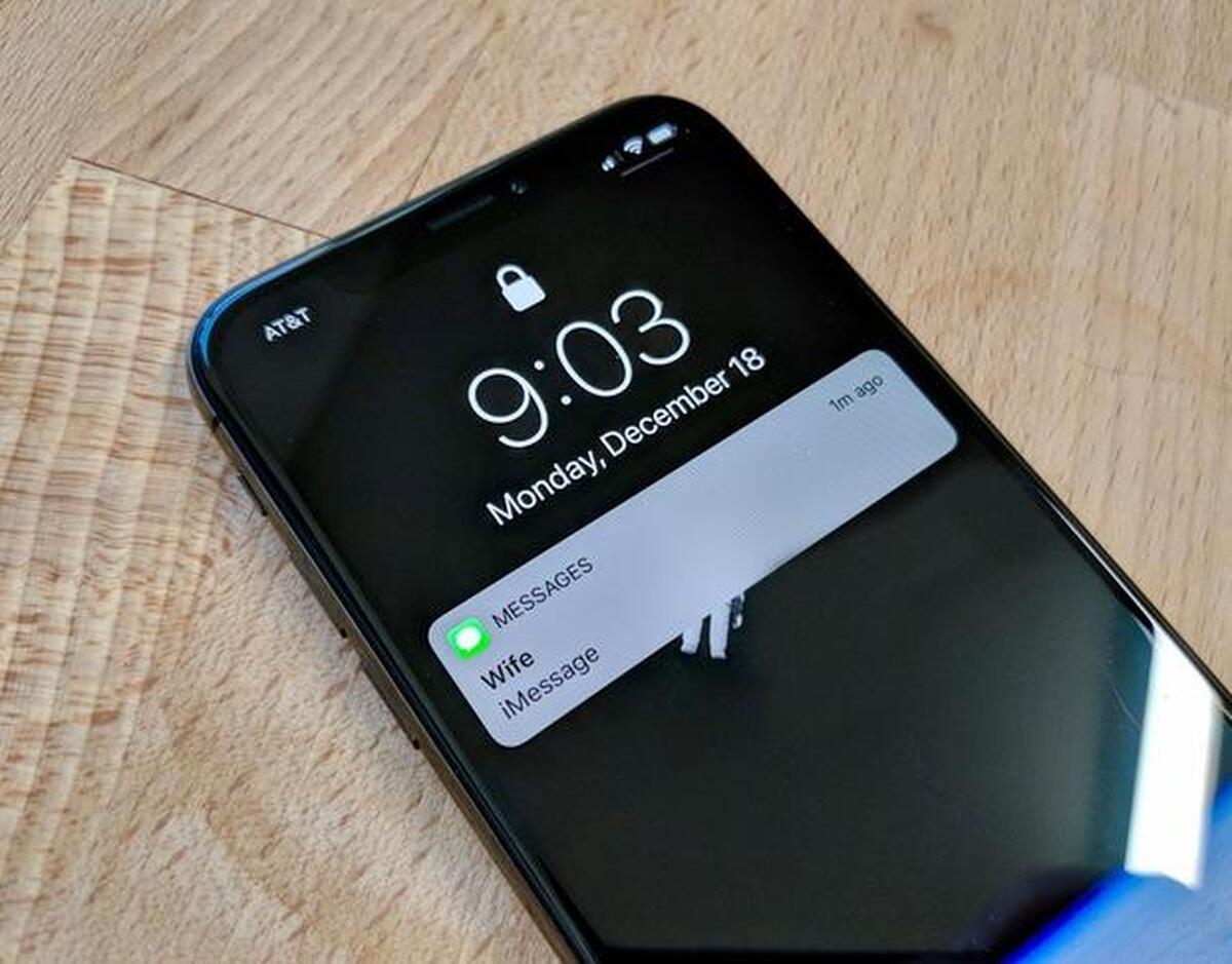
The iPhone lock screen doesn’t do anything other than show the time and date, as well as the battery level. The primary function of the lock screen is to display alerts when they come.
But the lock screen isn’t the best place for notifications they can blink when they come. But showing old notifications on the lock screen isn’t very useful. Swiping down to see the notification display in the iPhone will serve well.
 |
| image Source Google – iDownloadBlog |
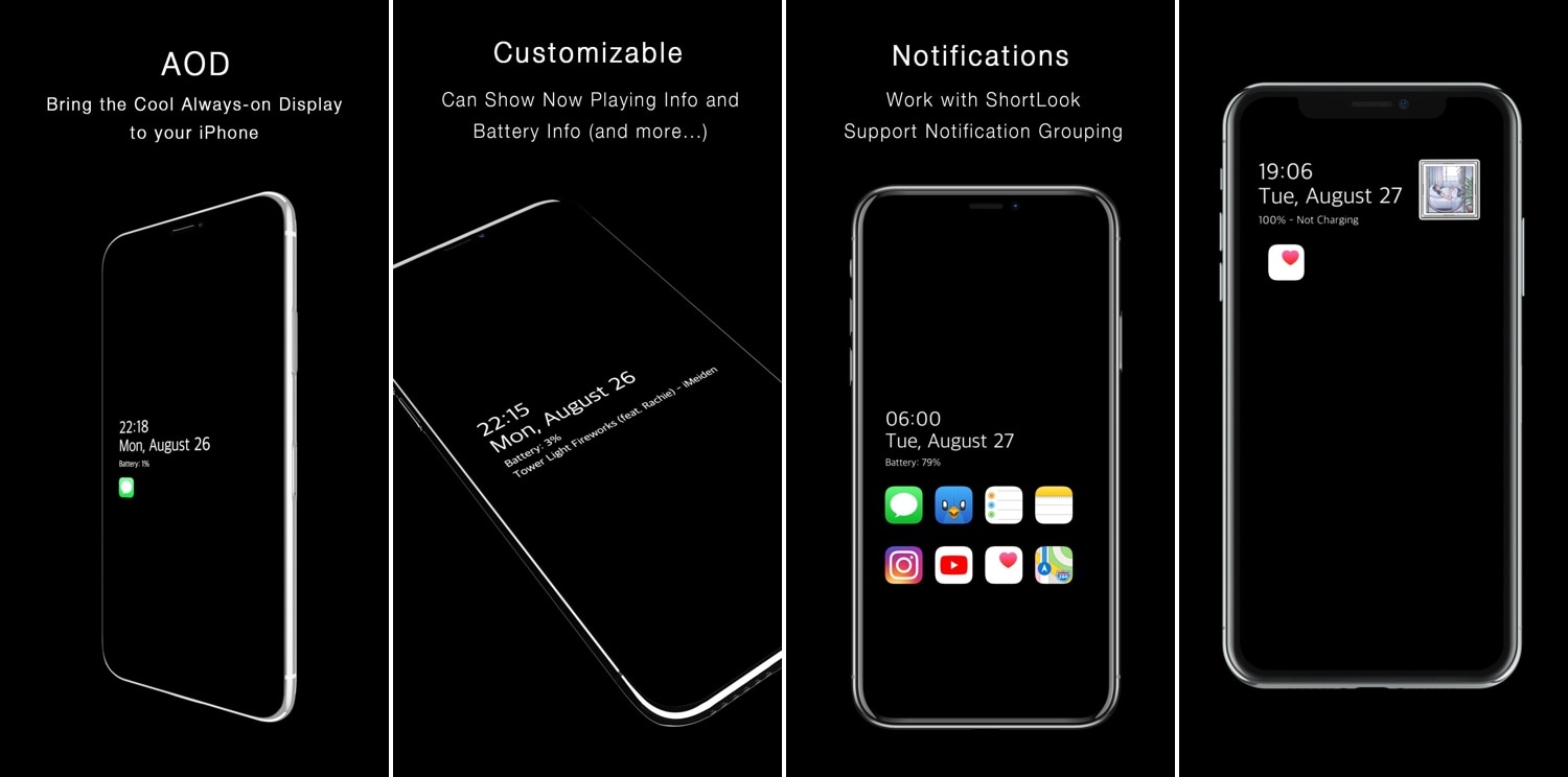
Always on Display
The Apple Watch screen is always on. For years, OLED Android phones have had always-on screens. There’s no reason why OLED iPhones can’t have them, either. With a few changes, an always-on “sleep” screen for the iPhone should be close to the lock screen.
On a dark background in iOS, it should display the time, date, and battery life, but no updates. New notifications in the iPhone will appear for a short time before disappearing. But we need fewer reasons to pick up our phones, not more.
 |
| image Source Google – 9to5Mac |
App Library
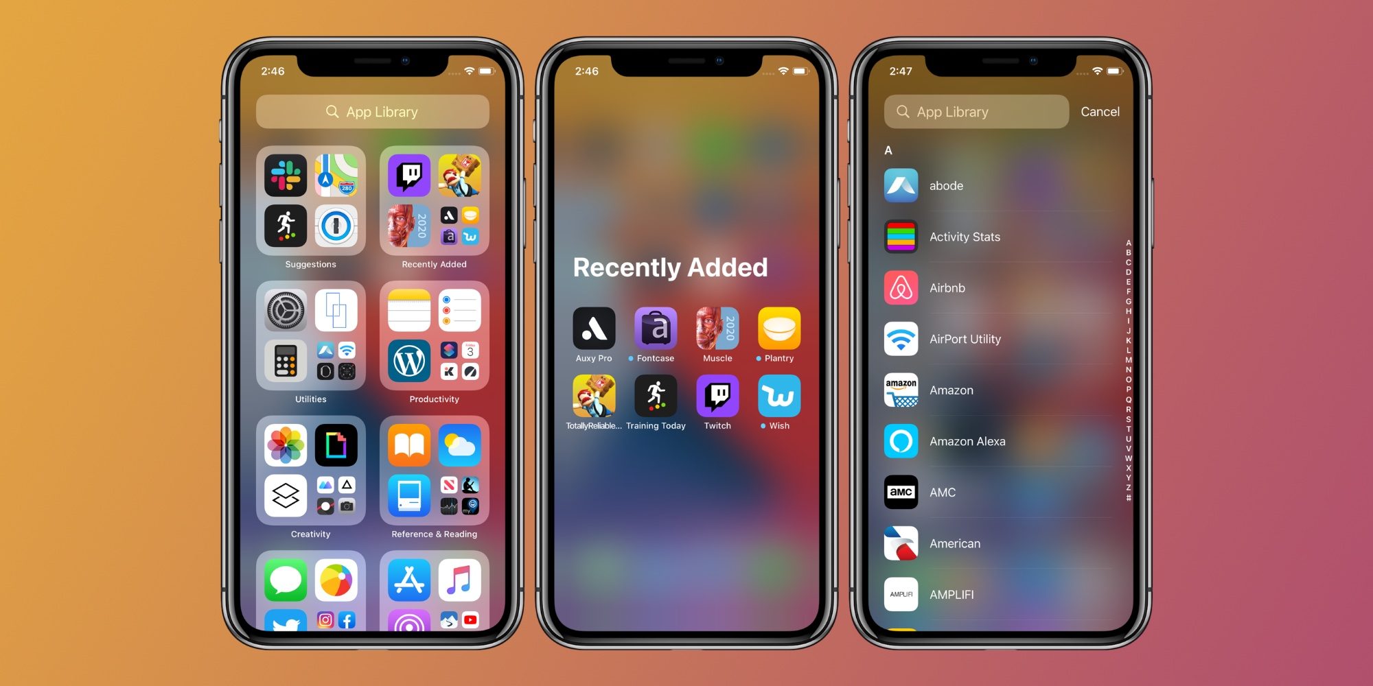
One of iOS 14’s biggest and best new features was the App Library in iPhone. It’s Apple’s response to the App Drawer, which Android users had for a long time. It’s a place where you see all your applications. It allows you to delete rarely-used apps from your Home screen.
Using the App Library on iPhone isn’t as easy as it should be. Its frequent rearrangement annoys all good UI conventions.
Each App Library group can change and display four different icons. The group can work when you tap anywhere on it. The category arrangement should be fixed and Editable (using the standard tap-and-hold “jiggle mode”).
Also, instead of having to drag down on the App Library screen or tap the search bar at the top. We should have a choice in Settings to make the App Library default to the list view.
Apps
 |
| image Source Google – AppleInsider |
Weather
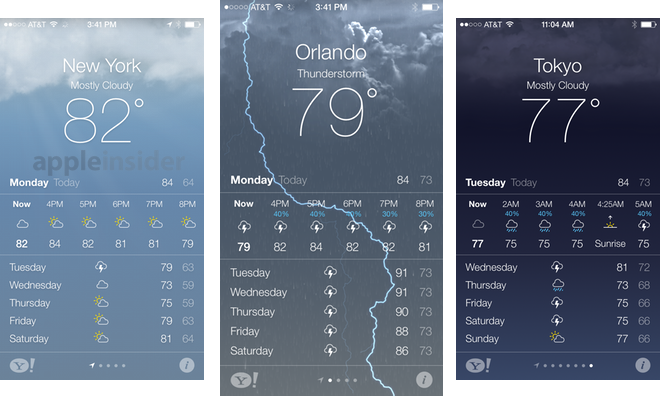
The Weather app is stuck in the past, and it hasn’t changed much since it was last redesigned in iOS 7. It’s past time to redesign its graphics and discard the data source of Weather Channel.
As everyone has choices with regard to weather. The latest Weather app should focus on flexibility and customization options. They are getting the design up to modern standards.
We’d like to see live radar, more detail, a real-time seven-day weather forecast, and weather. Service warnings, as well as a design that doesn’t look three years old, is on their way
 |
| image Source Google images – Creative Bloq |
Home
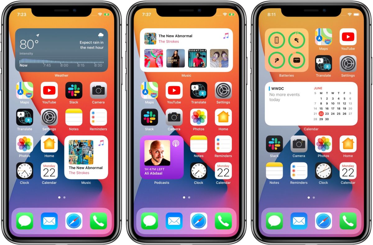
While we’re on the topic of built-in applications in iPhone that need to be up to date. The Home app seems as though Apple doesn’t give a damn about HomeKit.
A simple grid of squares with little details, and no direct feedback. Don’t know what happens when you tap one versus long-press? Instead of changing in a group, the lights should change.
 |
| Source Google image reuse – idownloadblog |
Stocks
Adding stock symbols by hand to get data you can’t use sounds like a waste. Imagine being able to pull all this information from your stock-trading apps. You can link it back to them to take action. Financial apps like Robinhood and TD Ameritrade can connect with Apple’s Stocks.
through an API they can connect ensuring that your Stocks are still up to date with your accounts. And if you want to make a trade, the Stocks app could deep-link to that exact stock within a supported app. With those updates, we can be able to open it to some extent.
Default Apps
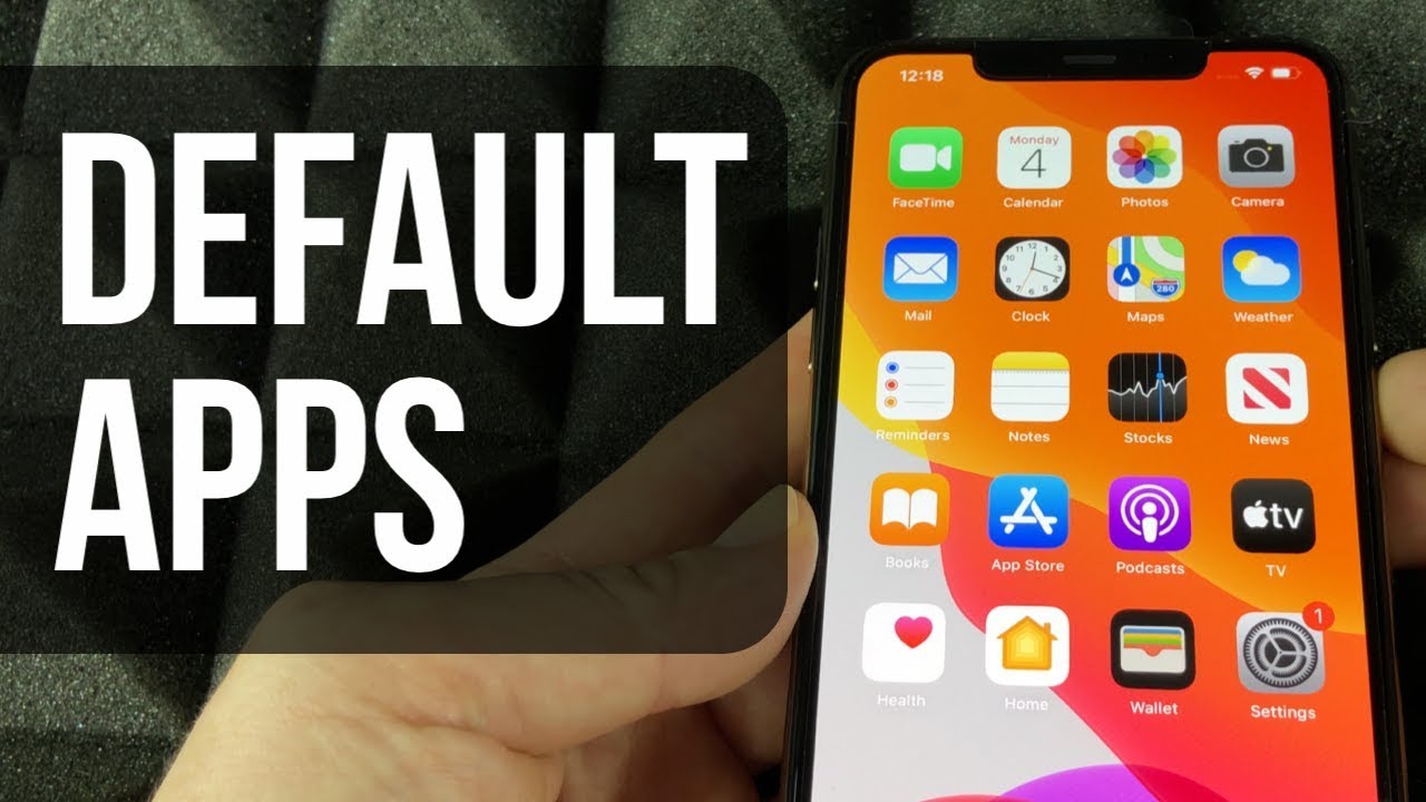
With iOS 14, you can set a different default web browser or email app. So, when you click on a link or send an email, it opens the app you want instead of Safari or Mail.
When you ask to play a song with Siri, artist, album, or podcast, it now asks which audio app you want to use. That’s not exactly the same thing (you can’t adjust defaults in settings), but it’s a start. Let’s go ahead and choose real defaults now.
There’s no reason why Apple shouldn’t take this a step higher. When you ask for directions or tap on an address, Apple Maps directions force you. This is not the way that it favors Apple, not its customers.
Also check: iOS 15 Upraise Apple Maps with 3D Graphics




GIPHY App Key not set. Please check settings